Product design
PagerDuty
Mobile App
PagerDuty is a cloud computing company that produces a SaaS incident response platform for IT departments. PagerDuty was focused on its desktop platform for incident management. Data from usability research revealed a large mobile audience. Working with Product Managers and UX Designers, I redesigned a user-friendly flow and design for the PagerDuty mobile app. The redesign incrementally increased user engagement each month by 25+%.
- Art Direction
- Product Design
- UX Research
- UI Design
- Mobile Design
- Visual Design
- Brand Identity
- Design System

Process
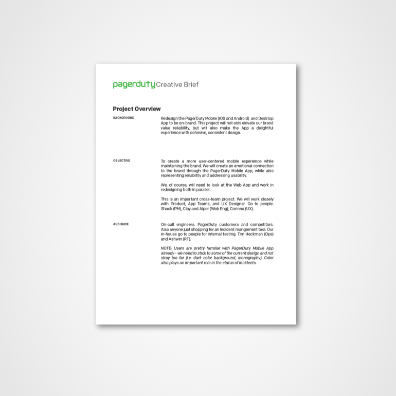
At the start of the project, I had several meetings and discussions with product managers and the mobile engineers. Once a project goal, timeline, and resources were decided, I drafted a creative brief.
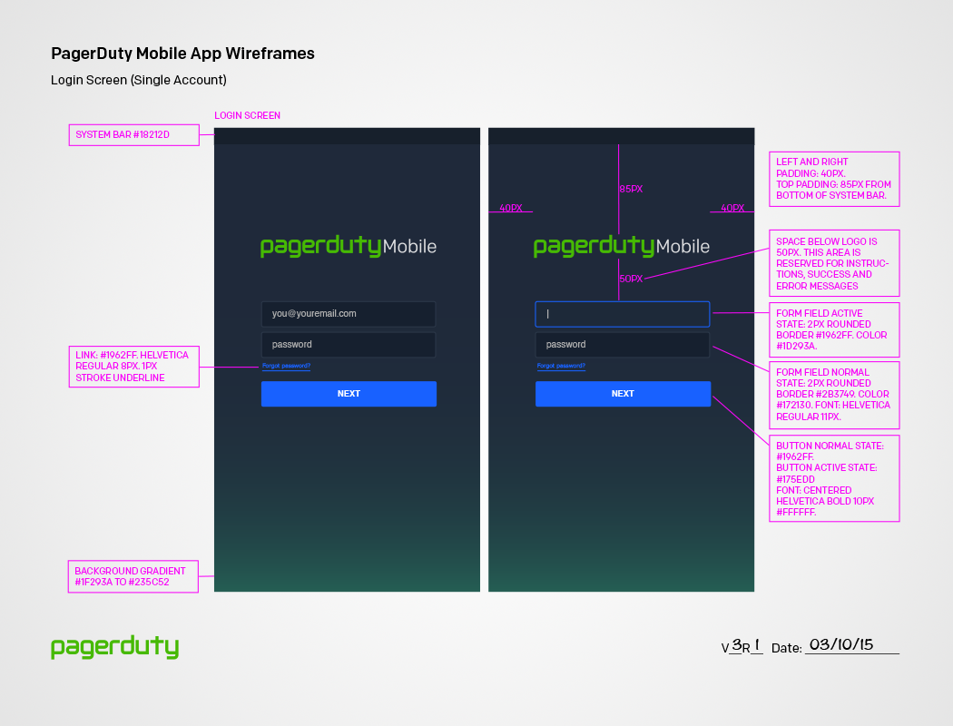
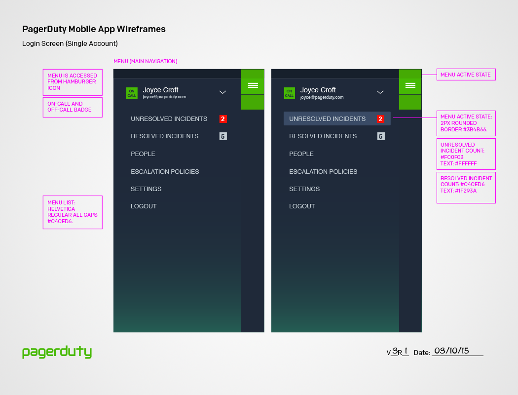
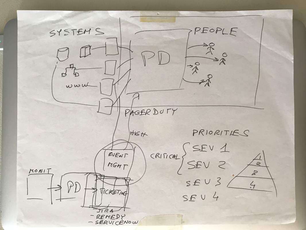
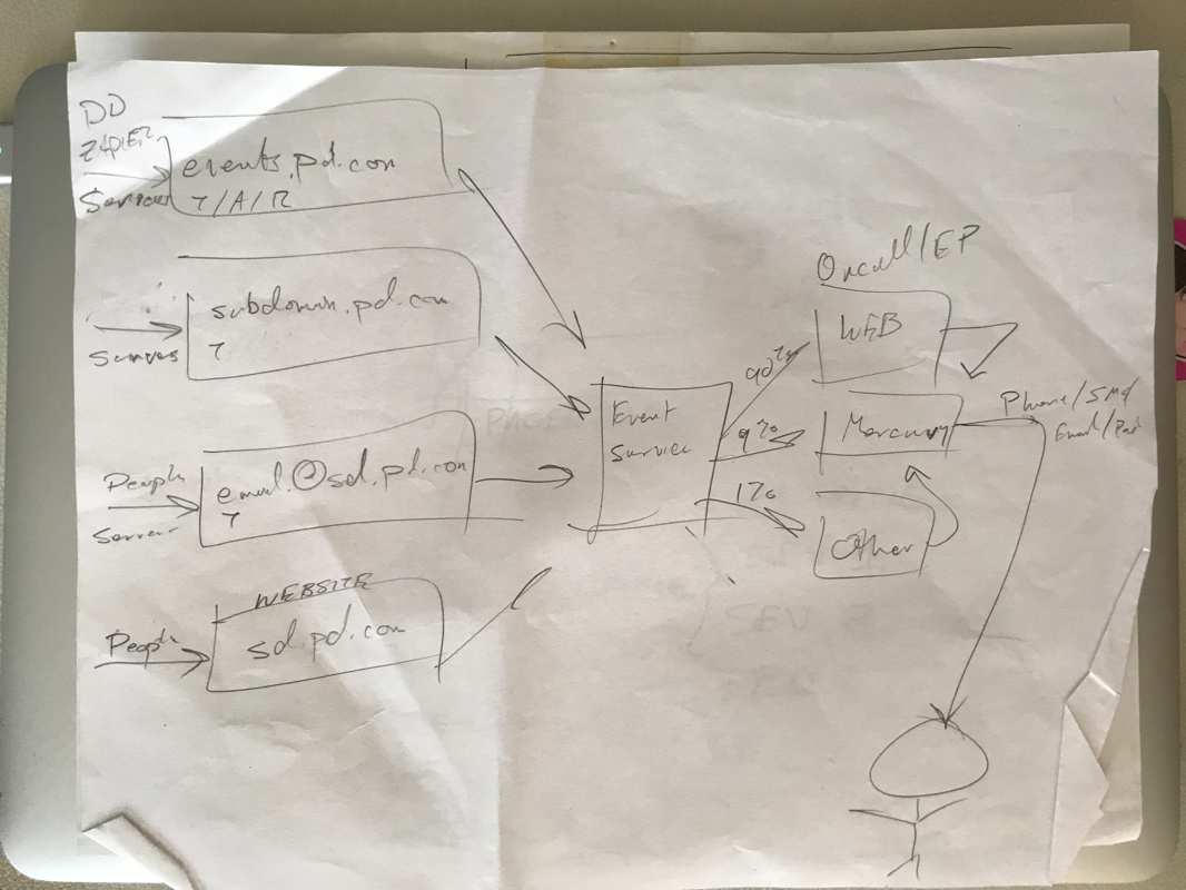
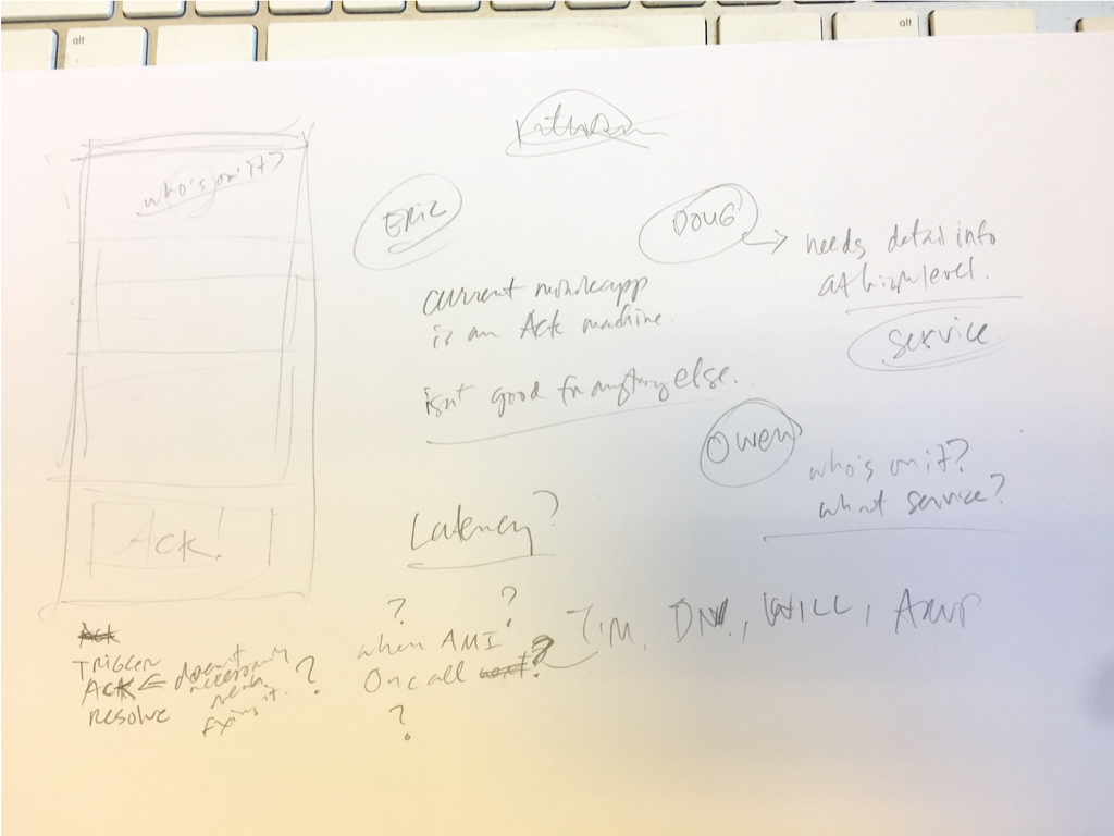
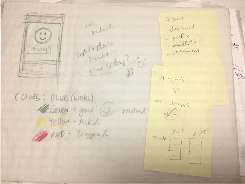
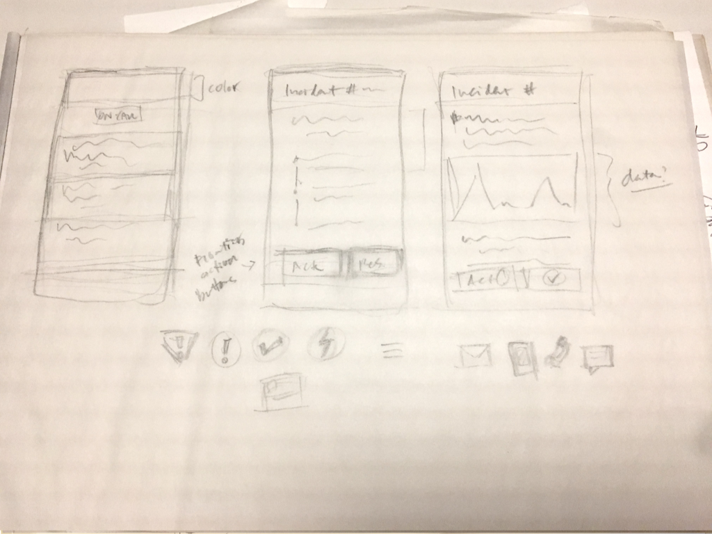
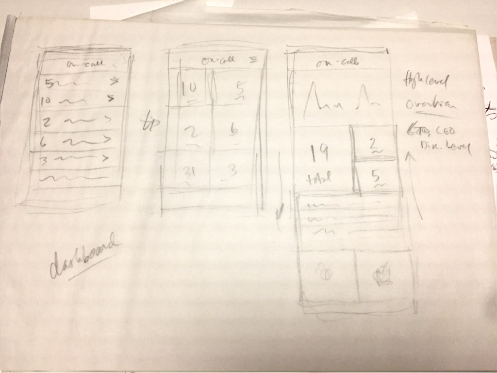
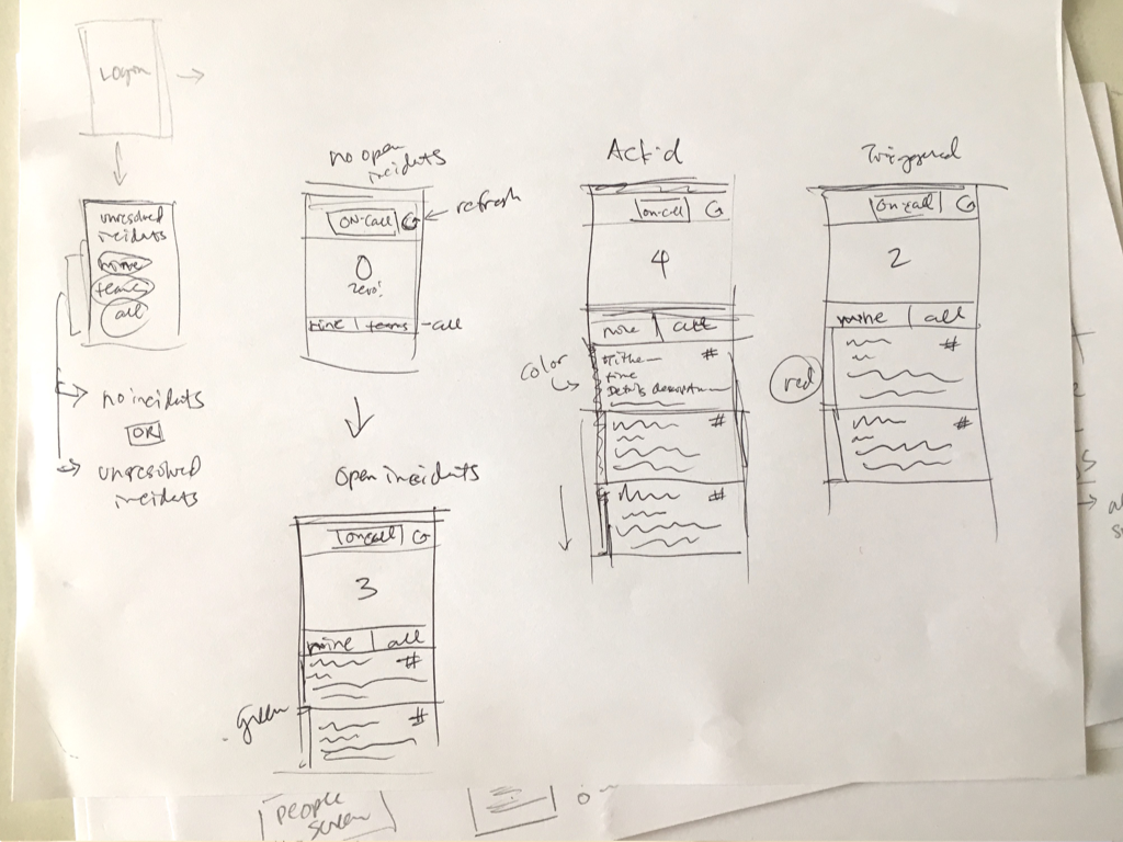
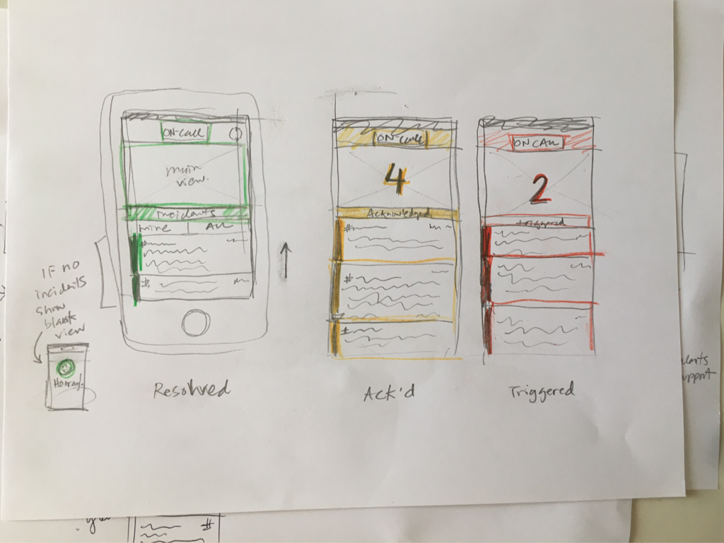
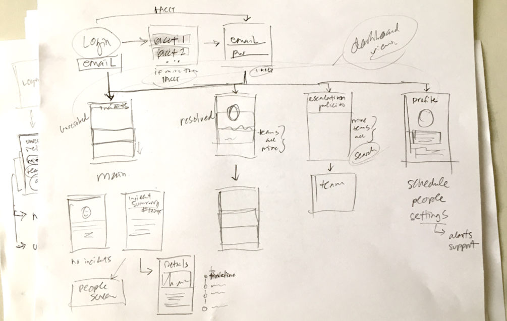
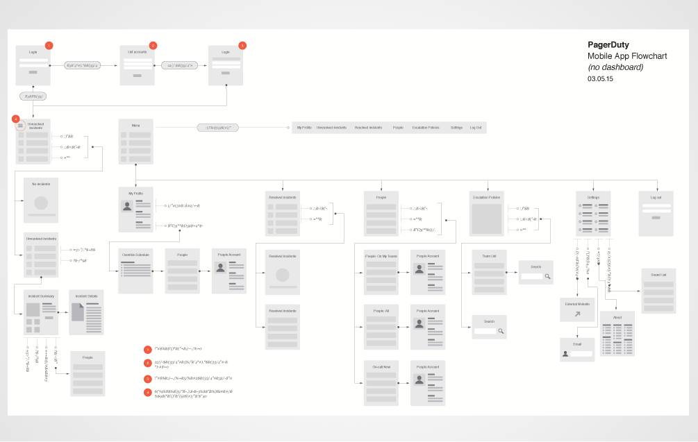
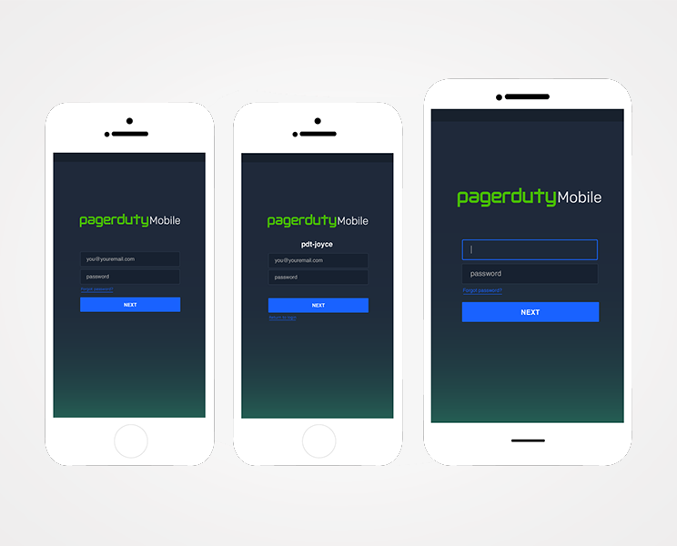
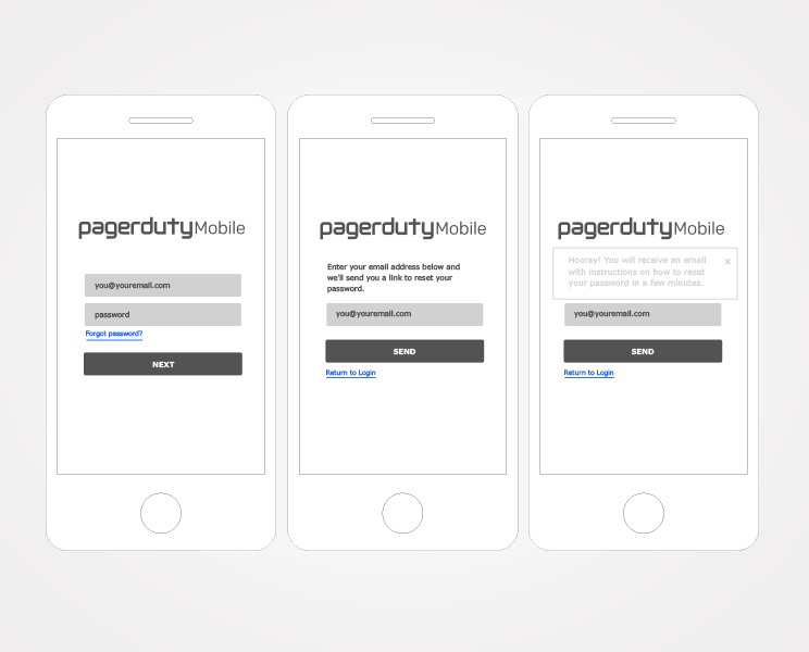
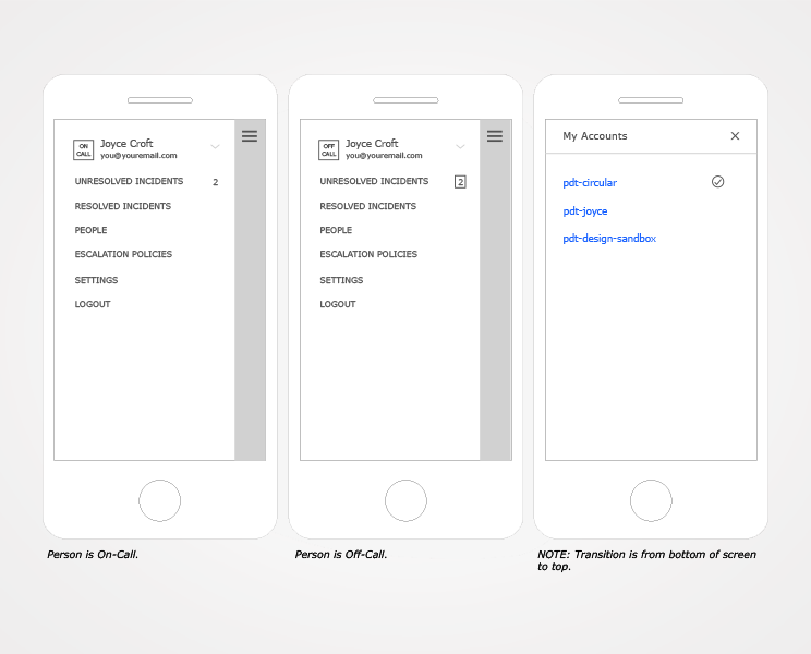
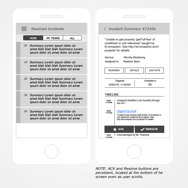
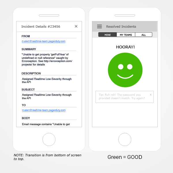
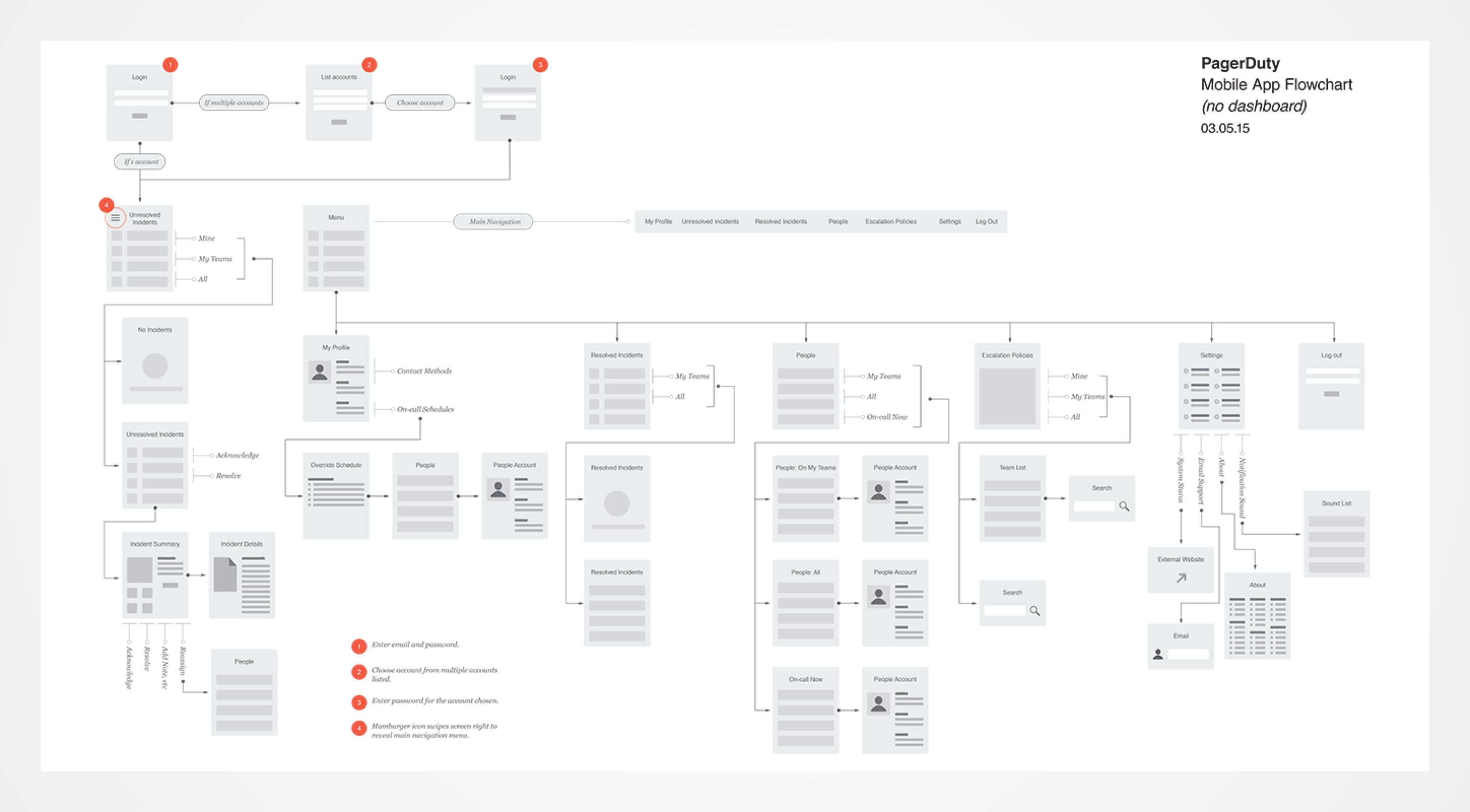
Once the project was kicked off, I began conducting user research. I interviewed several PagerDuty engineers. Once I had a good grasp on the different personas, I created flowcharts, wireframes, UI specifications, pixel perfect mockups, and improved overall user experience.
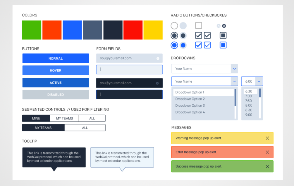
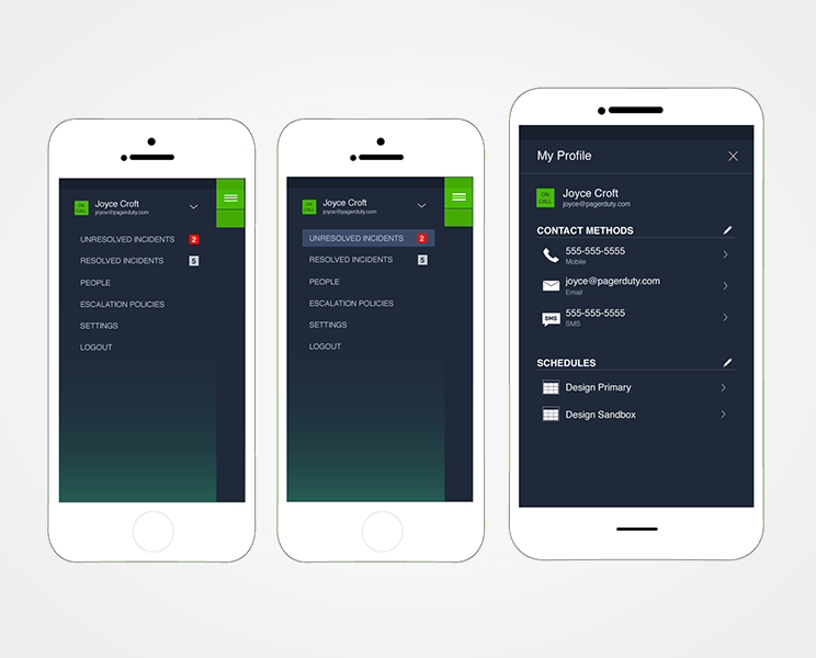
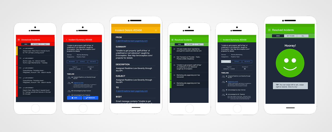
Color plays an important role in the PagerDuty brand, in particular, the status of incidents in the desktp and mobile apps. I worked closely with the UX Engineers to redesign the PagerDuty mobile app and reinforce the PagerDuty brand.

Collaboration
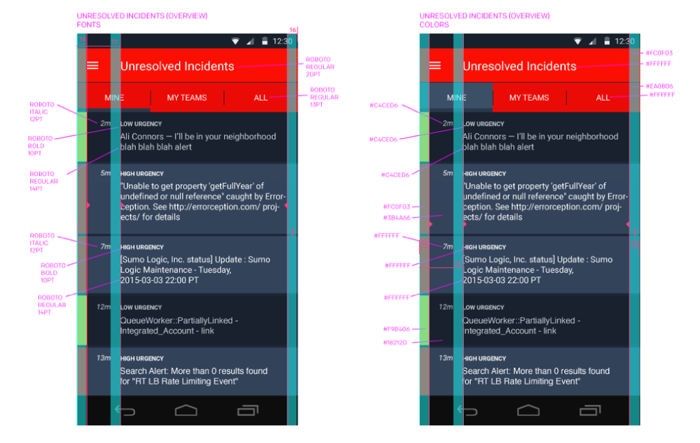
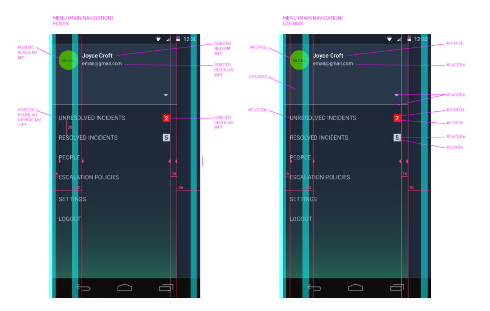
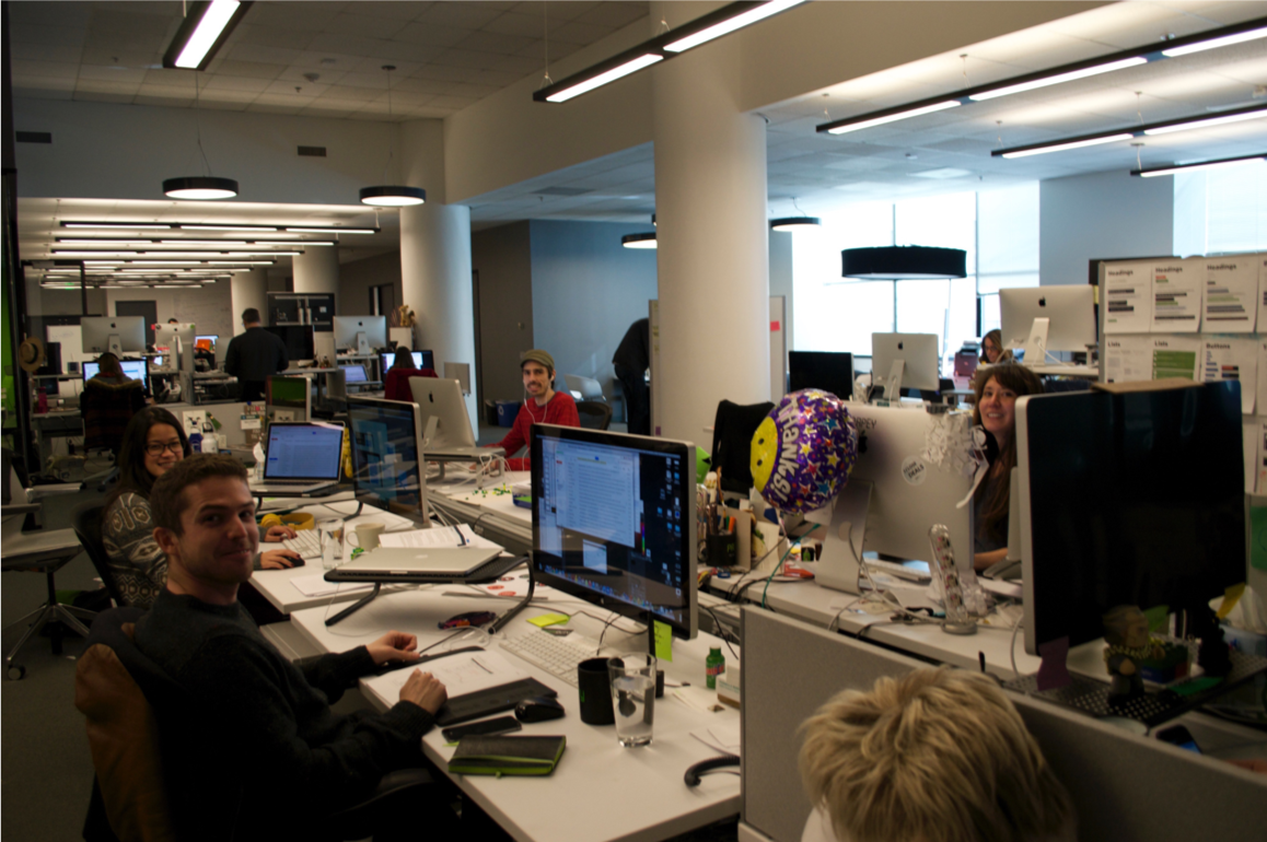
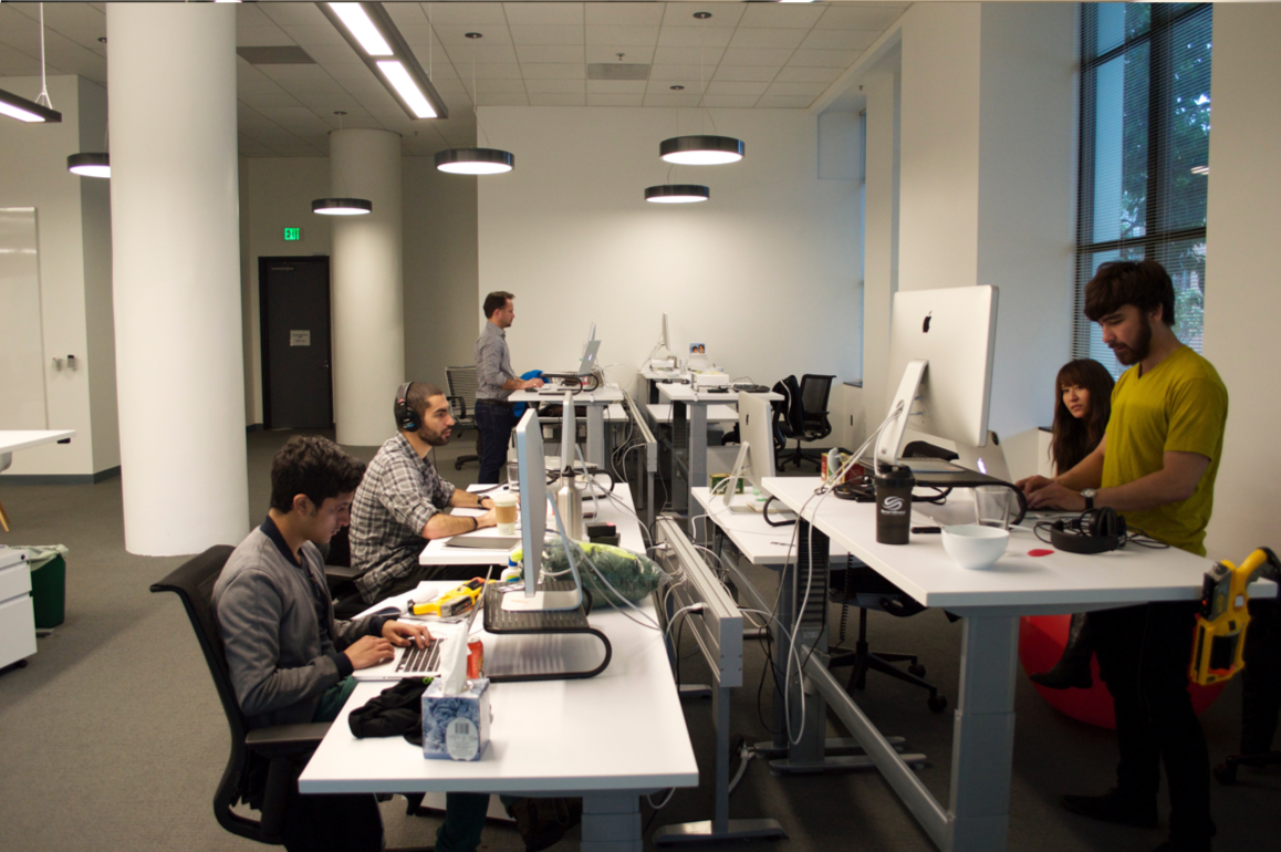
The PagerDuty mobile app redesign was a collaboration with designers, product managers, and engineers. During the design, I sat with the designers and we had several design critiques with the mockups and prototypes. Once the designs were finalized, I created redlines (for iOS and Android) and a UI Kit. I delivered the redlines and UI Kit to the mobile engineers. I also moved my desk to work next to the engineers to collaborate more closely.
